
UX Design Articles For User Experience Designers & User Researchers
-
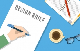
0 The 3 Most Important Elements Of A UX Design Brief
A UX Design Brief is a high level description of the solution, it’s features and personality. Basically, who it is designed for and what activities it is intended to encourage or empower. Work within constraints and use it to validate assumptions, but make sure that you share it with the team. 1. Focus What Is The focus? 2. Audience Who will the design serve? 3. Limits Are there any restrictions,expectations or constraints?
-
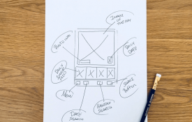
0 How To Use Sketching To Promote Creative Inspiration
Clarity Over Beauty Try not to use software as it will only slow things down. The Benefits Of Sketching Quick and inexpensive Helps you explore ideas Negates perfectionism Invites feedback Engages others Anyone can do it Start Sketching Ideas! Start with paper or on a whitebaord Set off some time Sketch ideas of key parts in the UX Try alternatives Vote and pick the best ideas
-
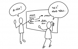
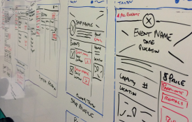
0 Share Designs With Teams By Using Sketch Boards
Sketch Boarding is a way to display sketches that you and the team have created to facilitate discussion. So get people on their feet, know your altitude and review with a focus. Assemble supplies Assemble / source sketch boards Put up sketches Schedule a review session Review best ideas
-
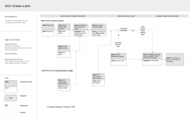
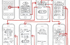
0 How To Get To Know Users By Using Task Flows
Task Flows By using Task Flows it gets you and the team thinking about how users will use the product in scenarios and sequences. Keep it lightweight with discrete flows to focus on. Use user scenarios as a starting point for prototypes and think multi channel and multi devices. Task Flow Guidelines Figure out the starting point and consider what comes next Go from start to finish Think about alternate entries or exits Add annotations where needed
-
0 Wireframes Demystified: A Simple UX Design Guide
What Is A Wireframe? A Wireframe is a basic outline of what a product should look and function like. Wireframes Demystified Wireframes show a skeleton of a user interface. They identify areas where content appears, such as images, text and navigation. Wireframes often include notations or notes explaining elements of the design in detail. They are a useful communication tool for designers who want clients to sign off on a design without getting hung up on the asthetics. Wireframes != Prototypes Wireframes do not really work as prototypes. In the early design phase you should be more interested in the navigation, workflow, terminology and functionality than in details of the visual design. Wireframes are usually produced towards the end of the design phase and not at the beginning. At this point, many important design decisions have already been made. Many people are obsessed with wireframes but in most projects, they aren't needed. They tend to be an overhead. You'll find that an electronic prototype, iterated as the project progresses, provides a much more powerful design communication tool than a wireframe. Simple UX Design Pick your tool and create a template layout Create a wireframe inventory and get wireframing Pay attention to sequence and state Use information density, design principles including error messages or states Seek and listen to feedback
-
0 A UX Designers Guide To Interaction Design
Interaction Design The process of identifying design solutions and creating prototype user interfaces. Design Patterns The designer’s dilemma - users want all the features and options to handle all of their special needs. Users want simplicity; they find it hard to choose between lots of options. The solution: Progressive disclosure, Initially show users only a few of the most important options. Consequently offer a larger set of specialised options upon request. Disclose these secondary features only if a user asks for them, meaning that most users can proceed with their tasks without worrying about this added complexity. Progressive Disclosure An interaction design technique that helps maintain the focus of a user’s attention by reducing clutter, confusion, and cognitive workload. This improves usability by presenting only the minimum information required for the task at hand. 2 rules of Progressive Disclosure Get the right split between initial and secondary features Make it obvious how to progress from the primary to the secondary disclosure levels Terminology Models A mismatch between the mental model and the conceptual model can lead to usability issues. The benefit of understanding peoples’ mental models is that it helps you organise and structure information and displays. Mental Model The internal, mental, representation that a user has about how a system works. Conceptual Model A conceptual model is the way the designer of a system has planned the system to work. Affordance The properties of an object that suggests to people how the object can be interacted with. Signifier The aspects of an object that a designer uses to indicate potential and intended affordances of an object. Rules Contrast The purpose of contrast is to organise the page and make it more interesting. If two items are not exactly the same, then make them different… really different. Determine what you want the focus to be and use contrast to create that focus. Alignment The purpose of alignment is to unify and organise the screen. Nothing should be placed on the page arbitrarily. Every item should have a visual connection with something on page. Repetition The purpose of repetition is to create consistency and to add visual interest. Repeat visual elements throughout the UI, such as fonts, sizes, colours, shapes, textures, spatial relationships, line thicknesses, graphic concepts, etc. Proximity The purpose of proximity is to organise and group the various parts of the UI.All related items should be chunked or grouped together so that the related items are made to appear as cohesive groups
-
0 The 4 Different Types Of Interaction Design Systems
1. Parallel Workspaces Lets users switch views to reach distinct sets of tools and information. Navigation is persistently available and is used when users perform a distinct sets of tasks. 2. Wizards and Tunnels Leads the user through the interface step by step, doing tasks in a prescribed order. Users’ decisions affect later choices. Commonly used choices are often set as defaults. Used when you’re designing a UI for a task that is long or complicated, and that will be novel for the user — it's not something that they do often or want much fine-grained control over. 3. The Organiser Workspace Put side-by-side panels on the interface. In one, show a set of items that the user can select at will; in the other, show the content of the selected item. Used when you’re presenting a list of objects, categories or actions and the user needs to get more detail. 4. Hub & Spoke (Hierarchical menu) Users return to a central hub such as a main menu screen to transition from one activity to the next. Use when you’re designing a UI where people will only want to complete a small number of tasks at any one time, such as telephone-based support, kiosks, cash machines and DVDs.
-
0 A UX Designers Guide To Using Form Elements
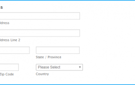
Text Entry Fields AdvantagesVery flexible and familiar to users. Occupies little screen space.DisadvantagesThe user must recall the text to enter rather than simply recognise the correct entry. There is scope for data-entry errors such as misspelling. The space inside the box belongs to the user. Some users think placeholder text should be in an input field because it disappears when the user starts answering a question, it’s hard to check answers after the labels are gone. Sometimes the placeholder text needs to be deleted by the user. Check Boxes AdvantagesEasy access to options Easy comparison of alternative options.DisadvantagesConsumes screen space. Only effective for a limited number of choices that are fixed and small (between 2 and 8). Single check boxes are difficult to align with other screen controls as they often possess long descriptions. Radio Buttons AdvantagesProvides easy access to and comparison of choices.Allows a textual description to be added to each choice item.DisadvantagesOnly effective for a limited number of choices that are fixed and small (between 2 and 8). Spin Box / Stepper AdvantagesConsumes relatively little screen space.Flexible, and permits either selection or typed entry.DisadvantagesDifficult to compare choices.Can be awkward to use/operate. Drop-Down / Pop-up List Box AdvantagesUnlimited number of choices Reminds user of available options Conserves screen space.DisadvantagesRequires an additional action to display the option list. May require scrolling in order to access all the list items. The list may be ordered in an unpredictable way, making it hard to find items. Luke Wroblewski - “Dropdowns should be the last resort.”

About
UX Designer
Created By
Vince Nardone
UX Consultant & User Research Trainer