
Articles For User Experience Designers & User Researchers
-

0 How To Decode UX Job Titles, Specs & Descriptions
UX Job Titles, Specs & Descriptions There are many discussions online that debate the subject of UX job titles. In my honest opinion, it doesn't really matter and I am going to tell you why. I have written this article to help the poor people that have to navigate the ocean of ux job titles advertised online. Having a lot of experience in this area, I decided to compile list of common job titles that have UX in them... UX Researcher UX/UI Designer UX/UI Engineer UX/UI Developer UX Designer UX Copywriter UX Consultant UX Manager UX Strategist UX Architect UX Product Manager UX Analyst Decoding UX Job Titles UX Researcher Take the UX only from the title and compare the level of UX maturity within the company to give you an idea of how flexible the role will be. How many UX people do they already have? Title e.g. UX Researcher Take the rest of the title as an indication of what you will actually be doing in the job. Just make sure that when you are reading job descriptions that the job is what the title says! Maturity Misconceptions There is a common misconception that the bigger the company the more mature they are with their UX practices. This is simply not true. It is the level of investment of UX at a CEO or board level of a company that will dictate the freedom in the role, whether that be a big or small company.
-
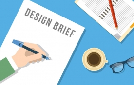
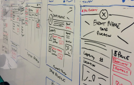
0 The 3 Most Important Elements Of A UX Design Brief
A UX Design Brief is a high level description of the solution, it’s features and personality. Basically, who it is designed for and what activities it is intended to encourage or empower. Work within constraints and use it to validate assumptions, but make sure that you share it with the team. 1. Focus What Is The focus? 2. Audience Who will the design serve? 3. Limits Are there any restrictions,expectations or constraints?
-
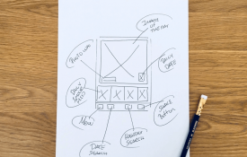
0 How To Use Sketching To Promote Creative Inspiration
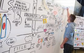
Clarity Over Beauty Try not to use software as it will only slow things down. The Benefits Of Sketching Quick and inexpensive Helps you explore ideas Negates perfectionism Invites feedback Engages others Anyone can do it Start Sketching Ideas! Start with paper or on a whitebaord Set off some time Sketch ideas of key parts in the UX Try alternatives Vote and pick the best ideas
-
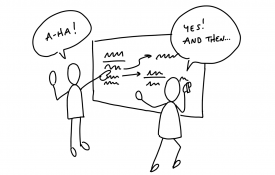
0 Share Designs With Teams By Using Sketch Boards
Sketch Boarding is a way to display sketches that you and the team have created to facilitate discussion. So get people on their feet, know your altitude and review with a focus. Assemble supplies Assemble / source sketch boards Put up sketches Schedule a review session Review best ideas
-
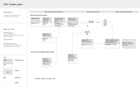
0 How To Get To Know Users By Using Task Flows
Task Flows By using Task Flows it gets you and the team thinking about how users will use the product in scenarios and sequences. Keep it lightweight with discrete flows to focus on. Use user scenarios as a starting point for prototypes and think multi channel and multi devices. Task Flow Guidelines Figure out the starting point and consider what comes next Go from start to finish Think about alternate entries or exits Add annotations where needed
-
0 Wireframes Demystified: A Simple UX Design Guide
What Is A Wireframe? A Wireframe is a basic outline of what a product should look and function like. Wireframes Demystified Wireframes show a skeleton of a user interface. They identify areas where content appears, such as images, text and navigation. Wireframes often include notations or notes explaining elements of the design in detail. They are a useful communication tool for designers who want clients to sign off on a design without getting hung up on the asthetics. Wireframes != Prototypes Wireframes do not really work as prototypes. In the early design phase you should be more interested in the navigation, workflow, terminology and functionality than in details of the visual design. Wireframes are usually produced towards the end of the design phase and not at the beginning. At this point, many important design decisions have already been made. Many people are obsessed with wireframes but in most projects, they aren't needed. They tend to be an overhead. You'll find that an electronic prototype, iterated as the project progresses, provides a much more powerful design communication tool than a wireframe. Simple UX Design Pick your tool and create a template layout Create a wireframe inventory and get wireframing Pay attention to sequence and state Use information density, design principles including error messages or states Seek and listen to feedback
-
0 How To Create Paper Prototypes In UX Design
Paper / Interactive Prototypes Paper prototyping is the best tool we have to design great user experiences. It allows involvement of users early in the design process. It will tell you how users use your product before you spend any money or development time. It supports iterative design. How To Create Paper Prototypes Sketch your user interface designs on multiple pieces of paper. Use whatever materials you like, but paper is ideal because you can throw it away. Concentrate on the user journey rather than the design. Think about the purpose Make your prototype pages Validate your prototype with yourself and others Does it work and feel as the design intended? Paper Prototype Myths It looks unprofessional I can't draw Whiteboarding is just as good Users behave differently with a paper It's just not real I can do that with software They are just wireframes You can't prototype interactions Paper prototypes are just as good as high-fidelity prototypes at detecting usability problems.
-
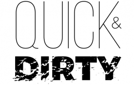
0 How To Quickly Usability Test Multiple Designs
Usability Testing does not have to be lengthy or complicated. There are ways to gather insights using a quick and dirty approach. This exercise is not for expert users but typical users, so maybe test 3 different designs. Find A User Show a design, sketch or printout to a user Ask The User What They Are Seeing Explain the main purpose of the screen and what it is supposed to do Ask how they would interact with it to accomplish a particular task Find More Volunteers Even use people in the team Iterate Or Change The Designs Identify anything confusing and revise Be careful when using this approach. It will give you basic insights and mostly opinions . This is because the user is not committing to steps in a journey.
-
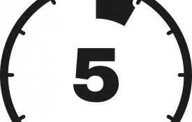
0 Have You Ever Tried A 5 Second Usability Test?
A Five Second Usability Test helps you see how clearly or memorable a given moment in the product is to users. 5 seconds is probably all the time you have to get users to understand your product. If they can't understand it in 5 seconds then there is something wrong with it. Find a volunteer Explain the test Show them the design Count to 5 Hide the design Ask what they remember and the purpose of it Did they get it right? Try it on some more users
-

0 How A UX Health Check Cycle Can Prioritise Work
A UX Health Check Cycle helps measure the baseline quality of UX and assess it over time. Gather a cross functional team and set up regular workshops Break the product into sections or areas Set competitive benchmarks and a target Measure yourself against those benchmarks Spot the biggest opportunities for improvement Repeat regularly A UX Health Check Cycle helps to get the team delivering value to users by fixing their problems, rather than just delivering software.
-

0 Black Hat Sessions Help Teams Critique Designs
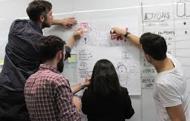
Black Hat Sessions help teams critique esigns and find what areas of the design can be improved. It gives the team permission to call things as they see them. It is a constructive forum for sharing concerns and creates a safe place for negative feedback to be given. It also puts all of these concerns into a format that you can see, manage and take charge of. Make time for a group session Find a large useable wall space Assemble a cross functional team Explain the rules Assume to the most critical, judgemental perspective Use post it notes and role play Start the clock Give the group 15-20mins to walk through designs Get them to write down on post it notes Review and look for themes Get the team to step back and look at all post it notes looking for anything missed Discuss and synthesize Engage the team in a discussion about any themes that emerge Record points on a whiteboard Close by discussing what is good about the designs End on a positive note Update the designs Revisit the designs to address these issues
-
0 A UX Designers Guide To Interaction Design
Interaction Design The process of identifying design solutions and creating prototype user interfaces. Design Patterns The designer’s dilemma - users want all the features and options to handle all of their special needs. Users want simplicity; they find it hard to choose between lots of options. The solution: Progressive disclosure, Initially show users only a few of the most important options. Consequently offer a larger set of specialised options upon request. Disclose these secondary features only if a user asks for them, meaning that most users can proceed with their tasks without worrying about this added complexity. Progressive Disclosure An interaction design technique that helps maintain the focus of a user’s attention by reducing clutter, confusion, and cognitive workload. This improves usability by presenting only the minimum information required for the task at hand. 2 rules of Progressive Disclosure Get the right split between initial and secondary features Make it obvious how to progress from the primary to the secondary disclosure levels Terminology Models A mismatch between the mental model and the conceptual model can lead to usability issues. The benefit of understanding peoples’ mental models is that it helps you organise and structure information and displays. Mental Model The internal, mental, representation that a user has about how a system works. Conceptual Model A conceptual model is the way the designer of a system has planned the system to work. Affordance The properties of an object that suggests to people how the object can be interacted with. Signifier The aspects of an object that a designer uses to indicate potential and intended affordances of an object. Rules Contrast The purpose of contrast is to organise the page and make it more interesting. If two items are not exactly the same, then make them different… really different. Determine what you want the focus to be and use contrast to create that focus. Alignment The purpose of alignment is to unify and organise the screen. Nothing should be placed on the page arbitrarily. Every item should have a visual connection with something on page. Repetition The purpose of repetition is to create consistency and to add visual interest. Repeat visual elements throughout the UI, such as fonts, sizes, colours, shapes, textures, spatial relationships, line thicknesses, graphic concepts, etc. Proximity The purpose of proximity is to organise and group the various parts of the UI.All related items should be chunked or grouped together so that the related items are made to appear as cohesive groups
-
0 The 4 Different Types Of Interaction Design Systems
1. Parallel Workspaces Lets users switch views to reach distinct sets of tools and information. Navigation is persistently available and is used when users perform a distinct sets of tasks. 2. Wizards and Tunnels Leads the user through the interface step by step, doing tasks in a prescribed order. Users’ decisions affect later choices. Commonly used choices are often set as defaults. Used when you’re designing a UI for a task that is long or complicated, and that will be novel for the user — it's not something that they do often or want much fine-grained control over. 3. The Organiser Workspace Put side-by-side panels on the interface. In one, show a set of items that the user can select at will; in the other, show the content of the selected item. Used when you’re presenting a list of objects, categories or actions and the user needs to get more detail. 4. Hub & Spoke (Hierarchical menu) Users return to a central hub such as a main menu screen to transition from one activity to the next. Use when you’re designing a UI where people will only want to complete a small number of tasks at any one time, such as telephone-based support, kiosks, cash machines and DVDs.
-
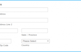
0 A UX Designers Guide To Using Form Elements
Text Entry Fields AdvantagesVery flexible and familiar to users. Occupies little screen space.DisadvantagesThe user must recall the text to enter rather than simply recognise the correct entry. There is scope for data-entry errors such as misspelling. The space inside the box belongs to the user. Some users think placeholder text should be in an input field because it disappears when the user starts answering a question, it’s hard to check answers after the labels are gone. Sometimes the placeholder text needs to be deleted by the user. Check Boxes AdvantagesEasy access to options Easy comparison of alternative options.DisadvantagesConsumes screen space. Only effective for a limited number of choices that are fixed and small (between 2 and 8). Single check boxes are difficult to align with other screen controls as they often possess long descriptions. Radio Buttons AdvantagesProvides easy access to and comparison of choices.Allows a textual description to be added to each choice item.DisadvantagesOnly effective for a limited number of choices that are fixed and small (between 2 and 8). Spin Box / Stepper AdvantagesConsumes relatively little screen space.Flexible, and permits either selection or typed entry.DisadvantagesDifficult to compare choices.Can be awkward to use/operate. Drop-Down / Pop-up List Box AdvantagesUnlimited number of choices Reminds user of available options Conserves screen space.DisadvantagesRequires an additional action to display the option list. May require scrolling in order to access all the list items. The list may be ordered in an unpredictable way, making it hard to find items. Luke Wroblewski - “Dropdowns should be the last resort.”
-

0 How To Deal With Low UX Maturity Within Companies
Break Up The Silos! Low UX maturity is very common in many companies across many industries. Silo companies do not have a holistic overview of their UX capacity, so try to visualise requirements and get involved as early as possible. Establish the fundamentals of the product and help others see how UX benefits the process by understanding time and resources to create one timeline with UX, and one without. Find compromises and play nicely with all parties using it as opportunity to learn, but try to own and direct how work gets executed and turn rubber stamps into opportunity. Do undercover user research, develop case studies and use storyboarding to give a narrative, as long as you try to "break bread" and turn co-workers into allies to build relationships. Think Like A Psychiatrist! Relationships are one of the most important means for a good UX foundation. Try to see things from other people's perspective. Interview the team on how they want to engage with UX. Try to build an informal UX network to promote broader UX uptake and educate others within the company. Ask others to participate by offering a strategy workshop with a sketch board session. Arrange pre-meetings to help you get team members to commit their support for your approach before the big reveal. Whatever you do, make sure you use relatable language, no jargon, but plain English! Common Myths It’s just web design? But we already do market research? UX is too expensive! It takes too much time! It isn’t statistically significant. But we already know what needs to be done. Common Problems The main problems you will come across in low UX maturity companies are badly defined system requirements, poor communications between customers, development and users or stakeholder politics.
-

0 How To Get Your Team Started With UX Design
Establish The Work Pick things that are instantly obvious Plan what activities you will perform Get permission and or support Get To Know Users Talk to and learn about user needs Design products for and with users See their perspective, feel their pain Envision better alternatives Get time with users that directly impacts the quality of the product Figure out what you know and don’t know Perform undercover research Start Designing Together Sketch your ideas on paper or whiteboard Enlist colleagues to generate ideas on a mood board Learn from other great products
-

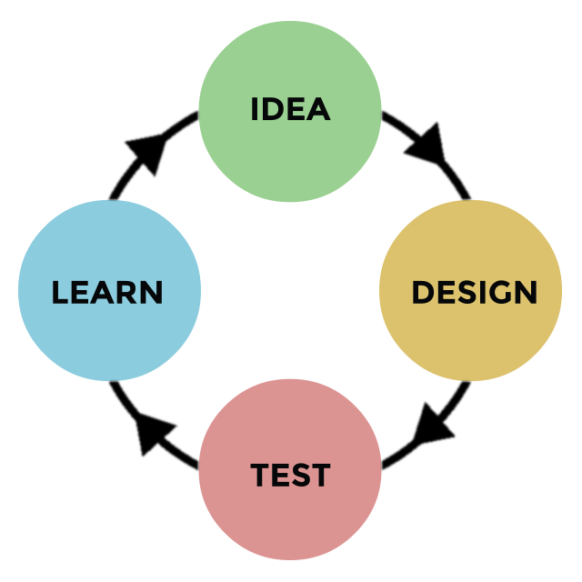
0 How To Make A UX Strategy Blueprint Plan
A UX Strategy Blueprint Plan is a plan of action to make sure that the user experience of an application is aligned with business objectives. It is the method by which you validate that solutions actually solve problems for real users. Challenges Problems? Obstacles? Aspirations? Desired outcomes? Achievement? Focus Areas Scope? Focus of impact? Users: Who? Where? What? How? (Scenarios) What area of UX: Information architecture, interaction design, visual design, content strategy or branding, usability, learnability, discoverability? Guiding Principles How will you overcome the challenges? Activities What types of UX activities are needed? Measurements What types of measurements will be employed? What metrics will be used to gauge success?
-
0 7 Steps To Successful Customer Journey Mapping
Step 1. Assemble Put together a core group of stakeholders (not only from their teams, but from others in the company like IT, front line employees, and subject matter experts). Choose stakeholders you feel will be invested in the project and willing to take responsibility. Step 2. Share The Vision Communicate the vision for the journey mapping project: a one-day workshop that will result in a set of customer journey hypotheses, which will be tested, refined, and examined for areas of improvement, and serve as living documents that will guide everyday interactions going forward. Step 3. Plan Plan for the scope and scale of the customer journeys to be mapped. Update customer personas. Step 4. Map Use the plan to set expectations with their stakeholders. During the session, use the updated personas and customer empathy worksheets to establish a stronger connection with customers. In each customer journey map, they include the target customer, a description of all the touchpoints, and what the customer is thinking, feeling, and doing along the way. Step 5. Validate After a productive workshop day you have a set of customer journey maps -- but these are really hypotheses, assumptions that need to be tested and validated; not only with real live customers, but with internal teams as well. Step 6. Improve Seeing that there are several parts of their customer journeys that need improvement, prioritise where they should focus first. Choose to start with some quick wins that will improve the customer experience while reinforcing the value of journey mapping within the company. Step 7. Aim High Once the company sees tangible improvements in key customer metrics, continue to push towards integrating the mapping process into the everyday. They work together to digitize the maps, using them as dashboards for ongoing projects. By assigning an owner to each map, they ensure that the customer journeys will continue to improve. With each passing day, you are closing in on their goal of becoming an industry leader in customer or user experience.
-
0 How To Map Information Architecture In Segments
Information Architecture The information architecture is the structure of information first and the design of the user interface second. It understands how people use content and how the structure should function to support them. It also grasps the range of content and functionality and how that needs to be structured. A Well Thought Out IA Matters The purpose of your information architecture is to help users understand where they are, what they’ve found, what’s around, and what to expect. As a result, your information architecture informs the content strategy through identifying word choice as well as informing user interface design and interaction design through playing a role in the wireframing and prototyping processes. Segmenting The IA Organisation Schemes and Structures(How you categorise and structure information Location, Alphabet, Time, Category, or Hierarchy) Labelling Systems(How you represent information) Navigation Systems(How users browse or move through information) Search Systems(How users look for information) By segmenting the AI you can help the user understand the interface.
-

0 Essential Questions That UX Designers Must Answer
Team Who is responsible for this project? Who is in charge of this project? Who knows the history / decisions made in this project? Who determines strategy for this project? Who specifies features and functions for this project? Who designs for this project? Who builds for this project? Who needs regular updates on this project? Who maintains the project? Goals What are the project goals? What are the priorities? Users Who are the target users? What are their motivations? What are their goals or passions? Strategy What is the value proposition for the project? Why will people use it? What differentiates this from the competition? What does it stand for? What is the vision? Tasks & Scenarios What are the primary tasks? Scenarios? Success & Measurement How does it make money? What influences this? What KPIs are tracked? Risk Have any risks been assessed up front?b
-

0 How UX Master Plans Can Build Internal UX Processes
A UX Master Plan defines a UX strategy by assessing or defining the business objectives and developing a UX plan in line with those objectives. Kick Off Meeting Assess or define the Team Assess or define the Problem Assess or define the Plan Reach consensus Assess or define next course of action Information Architecture Sort by location, alphabet, time, category, hierarchy Create a sitemap or logical structure Create a logical navigation structure High Level User Journeys Define user types or roles Map out each individual journey Personas and Interviews Recruit 5 users Set up interviews Collate information User Journeys Test Wireframes on users Refine and test again
-

0 The Benefits Of A UX Discovery Tour Plan
What are the priorities and how much awareness of UX Exists? With a UX Discovery Tour Plan you can find out what problems users are experiencing. Ask yourself what you want to learn, put together a list of interviewees and write down some questions you want to ask. They will probably include user role, goals, objectives and their priorities. Also find out if there are there any barriers or unanswered questions. Start Discovering Set up 30 min user interviews, explain to them why it will help and above all, be polite. Digest What You Found Review notes, find themes, expectations Validate assumptions about users Log problems, concerns or things tried or untried Have some questions to follow up with and find out who wants to be involved Sharing Is Caring Share what you learn by taking good notes. Think in advance how you report and list the top 3 priorities.
-
0 How To Run A Workshop To Find Areas For Improvement
Design The Box If it is a new product, host a work session and perform "Design The Box" exercise. State Goals For The Session If it is an existing product, brainstorm issues, pain points, UX priorities and next steps to address. Uncover Problem Areas Using post it notes or index cards, label problems in the product and any missed opportunities. Discuss Strengths Using post it notes or index cards, find themes, organise issues into groups and label these groups. Prioritise Together Vote on priorities as a team to gain consensus.
-
0 How To Run A Workshop To Create User Empathy
Design The Box Get the team to "Design The Box" and come up with 3 unique selling points for the product. Email From The Future Get the team to come up with a make belief email or tweet from a future customer of how the product could be perceived by them. Most importantly, how it made their lives better. Storyboarding A storyboard is a visual way to explain how a product can address customer needs. Break into teams and come up with scenarios to make your storyboards. Moodboarding A mood board is a visual way to help the team discuss their vision, feeling or inspiration.
-

0 What Is Known, Unknown & How Will You Learn?
Learning Plan A Learning Plan will help you find out what is known, unknown & how you will learn. It helps the team map out what you know, what you need to know and what you need to learn. Start With What You Know Keep in mind the main types of users, motivations, frustrations or delights. Note important features, functions or decision considerations and look at competitor products. Find out how much time users have and if there are any distractions. Find out what parts do they use most or least and what helps user goals? Certainties V Assumptions Work with the team for each assumption and indicate how confident you are, group questions and simplify. Brainstorm Research Methods For each question brainstorm how you will go about getting more information and think about the resources required. Plan Outputs What form will your evidence take?
-
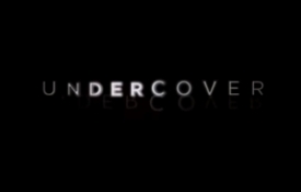
0 How To Perform Undercover User Research
Sometimes you just don't happen to work at a place that does any UX or has little budget or consideration for it. So in order to find out user concerns or behaviours you will need to go about it discretely... Think about target users - Who do you talk to and how? List your research questions - Mind map a list. Go into the field - Meet users in their environment and cover your research questions. Mine the data for insights - Review notes and build up a storage of information.
-

0 How To Create Proto Personas In UX Design
Proto Personas help the team think empathically about user needs, goals and challenges. Plan A Workshop Create proto personas with the team and include people who have direct access to users. Set Expectations Explain how it gets everyone thinking about the people that use the product. Create Teams Split into 3s and ask each group to discuss what they suspect or know about users. Focus on one type and create a proto persona. Fill In Basic Info For Each Proto Persona Ask groups to create a story for this person, name,work,age,living and what they do before and after using the product? Bring The Proto Personas To Life Ask teams to add photos, quotes and other forms of real life colour. A day in their life for example? Share And Discuss Keep the ones that are relevant
-

0 How To Perform A Heuristic Evaluation Exercise?
A Heuristic Evaluation Exercise is basically UX from start to finish. It helps you understand how the user experiences the product from start to finish whilst capturing observations. Block Off Some Time Set aside time to use the product from start to finish and capture observations. Begin At The Beginning Do as the user would do, even off screen. Pay Attention To Your Reactions Go slowly and be attentive to your inner voice. Go From Beginning To End Record as you go.
-

0 How To Do A Comparative Analysis Of Products
There will more than likely be a competing product with similar features on the market, so it is important to see what is out there and how that compares to your product. Comparative Analysis helps teams find out what standards and best practices users expect in a similar product. Pick 5 similar products to evaluate Create a list of areas to evaluate Content, design, features, flow intuitiveness, opportunities strengths and weaknesses Walk through each product Make notes Summarise findings
-

0 How To Analyse Content Patterns In UX Design
Content patterns are important in UX design because they have capability, access, structure and quality. So what content patterns do users have access to? How is the content structured and what is the overall quality? Pick key sections and look for recurring patterns or structure. Find the content patterns and list elements that come together then document what you find in a spreadsheet; e.g. user generated, editorial, instructional, support. Summarise key findings, share and discuss with the team.
-

0 How To Build Support For UX In Your Company
UX Is A Team Mindset “What you make” and “how you work” - is a mindset. Try to agree principles over processes. Principles articulate a vision for a UX approach. Invite People Be open, friendly and easily accessible and treat them as partners in the project The more you can facilitate a cross functional team, the more you will empower others to feel ownership in the process Make Things Together Meetings + Unstructured Conversations = Battlefield + Mixed Emotions Make ideas by making quick examples in collaboration, filtering the creative evaluation of a shared vision. Sketch, whiteboard or draw it out together. Listen Good Facilitate and take interest in other people's perspective Understand where they are coming from Let them do some talking and ask why or when you need to Know What Is Good Enough UX Work is never really done Get an idea of what is good enough
-

0 The Best Questions To Ask In UX Kick Off Meetings
Tell me about the company? How does the company make money? What state would you say the product is in? What stats/research has already been done? What approaches have you taken? What worked and what didn't? How do decisions usually get made? What, if anything turns out wrong? Where do you want to be? (Numbers) Who will be the main decision makers? (2/3 max) Who are the people involved in the project? Are there any constraints? (Time zone/remote) What is the best way of communicating? How frequently would you like to check in?
-
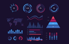
0 How To Do Data Dashboard Visualisation In UX Design
The Process Of Data Visualisation What data do you want to show, what questions are you trying to answer and what actions or decisions are you trying to enable? Who is consuming the data and what are their needs? What devices do they use and what data dimensions do you have to play with? What type of data is it and what are the key relationships? Is there a default format? If not try using 3 different, combinations. See how it looks and iterate. Methods Of Data Visualisation Tell a story and make it easy to understand. Dig deep to create hierarchy narrative. Make single insights nuances and simplify the data to convey a message. What Should It Do? Faster access to actionable insight. Huge Data Highlight story and make data relevant. How To Visualise Visualisation or infographic Scalable not scalable Persuasion or education Make Intentional Choices Data audience design Informative Persuasive Visual Audience Considerations Consider audience needs, know the uses and use their terminology. Data has properties so if it is numeric, continuous, binary, or categorical, try to define boundaries. Include or exclude data and decrease amount of data to define the desired knowledge. Colour Colour is not order so use saturation shades for grouping but bear in mind that colour has different meanings in different cultures. Chart Types Track Values Over Time(Line Area Chart) Compare Amounts Across A Category(Column Bar Chart) Compare Percentages(Pie Chart Doughnut Chart) Performance by Region(Maps Colour-Coded Overlays) Animated Visuals(Interaction Increases Value) Examples Geospatial maps Heatmaps Map overlays Interactive revelation Icon overlays Dashboard information Repetition of patterns Drilldowns

About
UX Designer
Created By
Vince Nardone
UX Consultant & User Research Trainer